


|

Adding Data
New outlines are created with an empty first item to make it easier to get started. Tap on this item to select it and enter text for this item.
If this empty item is missing, or you want to add more entries at some later time, tap the  item to append a new item to the end of the outline.
When you tap the Enter key (sometimes Return, Done, Next, depending on the keyboard on your device) the entry will be completed and a new empty entry will be appended immediately after the completed entry and selected for editing. This feature enables continuous entry of multiple outline items without tedious extra taps between each entry.
When you are done entering new data, just tap Enter again on the empty item. The empty item will be deleted and continuous entry mode will terminate.
To insert a new entry in the middle of an outline, first select the item before the point where you want to insert and then hit enter. This will “complete” the item you just selected (without changes if you don’t tap any other keys before tapping Enter) and insert a new empty item immediately after it. item to append a new item to the end of the outline.
When you tap the Enter key (sometimes Return, Done, Next, depending on the keyboard on your device) the entry will be completed and a new empty entry will be appended immediately after the completed entry and selected for editing. This feature enables continuous entry of multiple outline items without tedious extra taps between each entry.
When you are done entering new data, just tap Enter again on the empty item. The empty item will be deleted and continuous entry mode will terminate.
To insert a new entry in the middle of an outline, first select the item before the point where you want to insert and then hit enter. This will “complete” the item you just selected (without changes if you don’t tap any other keys before tapping Enter) and insert a new empty item immediately after it.
Manipulating the Outline
Most operations affecting the structure of the outline can be reversed using the Undo command from the Outline Editor menu. This includes deletion, indentation, adding, and moving.
To scroll an outline that has grown larger than can be displayed on the screen, touch the screen and slide your finger up or down.
• Indentation and Grouping
Grapevine uses indentation to give a hierarchical structure to the outline. Indentation of an element is accomplished with slide gestures. Slide an element to the right to indent it relative to its predecessor. This makes the element a child and makes the predecessor its parent. Slide an element to the left to remove the indentation, effectively promoting a child to be a sibling of its former parent.
Be careful when sliding to the right to indent an item not to do a “fling” to the right, as this would delete the item. (And remember that Undo is your friend.) A “slide” gesture occurs when your finger motion stops before you release. A “fling” gesture occurs when your finger is still moving when it stops touching the display.
• Re-sequencing
To move items up or down in the list, switch the editor into Move Mode by tapping the  icon. The icon will change to icon. The icon will change to  to indicate that the application is in Move Mode. to indicate that the application is in Move Mode.
Move Mode is a temporary state that changes how drag gestures are interpreted. In “Normal” mode drag gestures are interpreted either to scroll the outline or to indent or delete items. In “Move” mode, drag gestures are interpreted to move an outline element (with its descendants) to a new location. Move Mode will automatically cancel after you move an item, so to move multiple items tap the icon before each move.
Tapping the icon again will take it out of Move Mode.
Note that normal scrolling does not work when in Move Mode because the touch-drag gesture normally reserved for scrolling is used to drag and drop items to new locations. When dragging an item, the list will still scroll when you get near the top or bottom of the screen so you can move items anywhere in the list, but the item you wish to move must be visible before you enter move mode.
In the event that you accidentally move an item unintentionally, you can rely on the Undo operation (accessible from the Outline Editor menu) to restore the item to its previous location.
(Undo is implemented as a stack, so an unlimited number of operations can be undone by tapping Undo repeatedly, provided this is done before exiting the outline.)
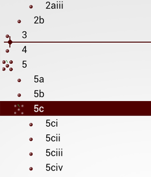
Once in Move Mode you can move an item by touching and dragging it to the target location. When you touch the item it will be highlighted to show which item is moving, and a cursor will be displayed showing the proposed insertion point. By dragging this cursor you can control both where in the outline the item will be inserted and control the indentation level of the insertion (i.e. whether it will be a child or a sibling of the item above it). To control indentation, align the vertical bar of the cursor with the approximate center of the expansion icons representing the desired indentation level. In the figure below the item “5c” (along with its children) will be inserted between “3” and “4” as a sibling (at their same level of indent).
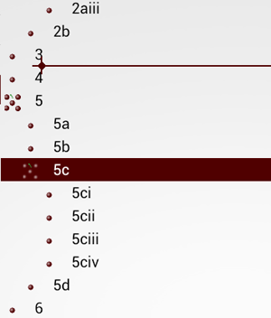
In the figure below the item “5c” (along with its children) will be inserted between “3” and “4” as a sibling (at their same level of indent). In the next figure, the item “5c” and its children will be inserted as a child of item “3”.
• Deleting
Elements can be deleted using a fling-right gesture. Note that deleting an element that has children will delete its children as well.
If you are using the Completed field (checkboxes for each item), you can also purge all items marked complete using the Purge Completed Items command from the Outline Editor menu. (Note that a parent marked complete will still not be deleted if it has incomplete children.)
• Expanding and Collapsing
One of the key features of a hierarchical outliner is the ability to collapse nodes of the outline to hide all of the descendants (children, children of the children, etc.) of a parent. In Grapevine this is managed primarily through tapping the icon at the beginning of the line.
This icon will be in one of three states:
 An item with no children An item with no children
 An item with children, currently collapsed An item with children, currently collapsed
 An item with children, currently expanded An item with children, currently expanded
By tapping the icon for an item with children the expansion state will toggle and the children will alternately be visible or hidden.
You can also collapse everything, or expand everything, by using the corresponding menu commands on the Outline Editor menu.
Editing the Details
For many applications the primary text field is the only field needed for the outline. However, for some applications additional fields may be useful. To support these applications, Grapevine incorporates several additional fields. These are present in every outline whether they are displayed or not. This means you can use them later even if you didn’t plan for them when you originally created the outline.
 These fields can be selectively displayed in the normal Outline Editor display by configuring them from the Outline Settings->View Configuration dialog. By displaying the fields you can also edit them directly from the Outline Editor by tapping on the target field. (See Secondary Fields below for more information.) These fields can be selectively displayed in the normal Outline Editor display by configuring them from the Outline Settings->View Configuration dialog. By displaying the fields you can also edit them directly from the Outline Editor by tapping on the target field. (See Secondary Fields below for more information.)
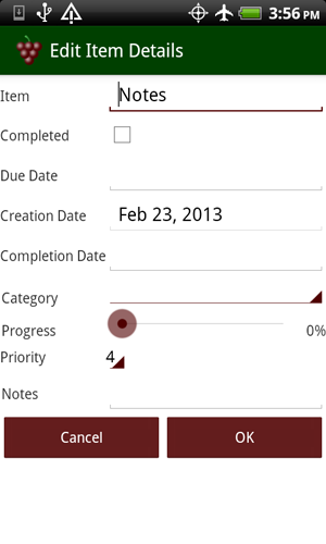
Because screen space is limited on most mobile devices, if you don’t use a field frequently it may be preferable to not display it, but still be able to access it when needed. To accomplish this, Grapevine incorporates a Detail Editor. Access the Detail Editor by long-pressing on the specific item you wish to edit. This will bring up the Detail Editor, pre-loaded with the current information for the selected item. You can edit all fields from this dialog. When done either tap OK (to save the changes) or Cancel (to leave the item unchanged).
Tapping on the “Due Date” or “Completion Date” fields will bring up a date picker. “Creation Date” is displayed, but not editable. By design creation date is set to today’s date when an item is created and is not modifiable after that.
Tapping on the “Category” field will bring up a list of available categories to which the item can be assigned. New outlines are created with no pre-defined categories (unless the new outline was created by the cloning process). (To define categories use the Edit Categories command from the Outline Editor menu. See Defining Categories below for more information.)
“Progress” is represented by a slider with text to the right showing the percent complete.
“Priority” is a set of fixed values from 0 to 9. The application currently makes no distinction as to which priority is most important, though the most common convention seems to be for smaller numbers to represent higher priority.
“Notes” is another text field, and can be as long as you like. If you want to use this field you should read the Notes section under Secondary Fields below for more information.
 Secondary Fields Secondary Fields
Beyond the primary “Item” field, Grapevine outlines include support for a number of additional fields that can provide more detail for advanced outlines. These fields are present in the raw data for all outlines to make it easy to change what information is available after the initial creation of the outline. See the Detail Editor section above for more information on accessing these fields directly without displaying them in the Outline Editor.
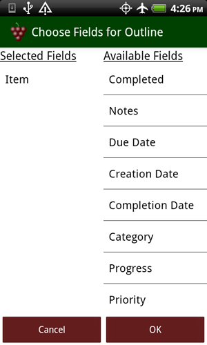
For advanced outlines you may want to make some combination of these fields a part of the normal outline editor display. Grapevine allows you to select which fields are displayed, and in what order, through the Outline Settings->View Configuration dialog.ViewConfiguration
Fields on the left under “Selected Fields” will be displayed in the Outline Editor, with the top-most field on the left and sequential fields building to the right. Fields on the right under “Available Fields” are fields that are available for display but not currently selected. You can move any field from one list to the other by tapping on it.
Note that the Selected Fields list builds from the top down, so you need to select fields in the order you want them displayed.
In the example to the right, if you wanted a field displayed before the Item primary field you would need to first deselect it (by tapping it and moving it back to the Available Fields column), selecting any fields you want in front of it (like maybe “Completed”), and then selecting the Item field again.
Also note that all fields except “Item” and “Notes” are fixed-width on the display. You can use this observation to your advantage in making the layout easy to read. Because of the variable indentation of the left edge of the outline, if you put fixed-width fields on the left edge they will not line up vertically under the column header. On the other hand, if you put all of the fixed width fields on the right (against the straight right edge of the screen), they will line up in columns for easy interpretation.
(Column headers are displayed automatically when fields are selected for display where the definition of the field may not be obvious from its presentation. For example, a date field is obviously a date, but which date field is it? So any time a date field is displayed headers are generated. Similarly “Category” and “Priority” may have a similar appearance depending on what categories the user has defined, so including either of these fields will result in a header being displayed.)
• Notes
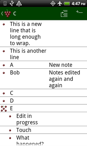
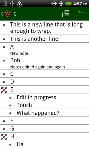
The “Notes” field allows you to associate additional text with an item. Grapevine provides three different ways (beyond using the Detail Editor) that you can use to display notes in the Outline Editor. From Outline Settings->Note Display Mode you can select among “Inline Text”, “Inline Icon”, or “Subtext” display formats.
 “Inline Text” is suited for situations where the notes are generally short and you want them in their own column for easy identification in the outline. In this mode you can also edit the note text by tapping on the note field. “Inline Text” is suited for situations where the notes are generally short and you want them in their own column for easy identification in the outline. In this mode you can also edit the note text by tapping on the note field.
“Inline Icon” is suited for situations where you don’t want to give up so much column space and don’t need to see the actual note text in the Outline Editor display. Items that do not have a note will have the  icon, where items that do have a note will have the icon, where items that do have a note will have the  icon. Tapping on the icon will bring up the text of the note in an editor where you can review and/or edit the text. icon. Tapping on the icon will bring up the text of the note in an editor where you can review and/or edit the text.
“Subtext” is useful in situations where you have longer notes that need to be readily visible in the Outline Editor. The text of the note will be displayed on a second line below the other item fields with the same indent but with a smaller type size to distinguish it from the primary item text and other fields. As with the “Inline Text” mode, you can edit this text by tapping on the note text.
(When you use the “Subtext” note display mode you may also want to enable dividers to be displayed between the items of the outline to make it clear that the note is associated with the item above it. This is done from the Outline Settings->Display Dividers menu option.)
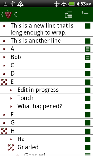
• Completed
The “Completed” field displays a checkbox that can be toggled by tapping the checkbox icon.
Note that if you are using the “Completed” field you can configure whether or not this status is automatically “rolled up” to an item’s ancestors (parents, grandparents, etc.) using the “Aggregate Completion Status” configuration in the Outline Settings menu. If enabled, each parent’s completion status will reflect whether or not all of its children are complete. If disabled, each parent will have its own completion status independent of the status of its children.
Also note that when you check the “Completed” field the “Completion Date” field is automatically set to the current date. You can subsequently override the completion date if you so desire. See the Completion Date section below for more information.
• Progress
The “Progress” field displays a numeric text field showing the percent completion as an integer value from 0 to 100. Tapping on this field will bring up a slider that allows you to adjust the percent complete.
Note that if you are using the “Progress” field you can configure whether or not this status is automatically “rolled up” to an item’s ancestors (parents, grandparents, etc.) using the “Aggregate Progress” configuration in the Outline Settings menu. If enabled, aggregation will assume that all children of a parent are weighted equally and will set the parent’s “Progress” field to the average of all of its children. If disabled, the parent will maintain its own progress value independent of the progress of its children.
• Priority
The “Priority” field displays a numeric text field with values from 0 to 9. Tapping on the text field brings up a selector that will allow you to choose a different value.
• Category
The “Category” field displays a text field with a value chosen from one of the user defined categories. See Defining Categories below for more information. Tapping on this field brings up a selector that will allow you to choose a different category from those currently defined.
• Due Date
The “Due Date” field displays a date, presumably when the item or task is due (though exactly what this date represents is up to you—it could be a birthday or any other date value). The display is month/day (which might be reversed depending on your localization settings). Year is intentionally omitted to conserve valuable screen space, but the year is stored in the outline and is accessible from the Detail Editor or by tapping on the date to bring up the date picker.
Tapping on the “Due Date” field will bring up a date picker to enable setting the date.
If you are using the “Due Date” field you can configure whether or not this status is automatically “rolled up” to an item’s ancestors (parents, grandparents, etc.) using the “Aggregate Due Date” configuration in the Outline Settings menu. If enabled, aggregation will set the parent’s due date to be the latest date of any of its children. If disabled, the parent will maintain its own due date independent of its children.
• Completion Date
The “Completion Date” field displays a date, presumably when the item or task is completed (though exactly what this date represents is up to you—it could be a birthday or any other date value). The display is month/day (which might be reversed depending on your localization settings). Year is intentionally omitted to conserve valuable screen space, but the year is stored in the outline and is accessible from the Detail Editor or by tapping on the date to bring up the date picker.
Tapping on the “Completion Date” field will bring up a date picker to enable setting the date.
Note that this date will be set automatically to the current date if the user sets the Completed flag on the item.
If you are using the “Completion Date” field you can configure whether or not this status is automatically “rolled up” to an item’s ancestors (parents, grandparents, etc.) using the “Aggregate Completion Date” configuration in the Outline Settings menu. If enabled, aggregation will set the parent’s completion date to be the latest date of any of its children. If disabled, the parent will maintain its own completion date independent of its children.
• Creation Date
The “Creation Date” field displays the date when the item was originally created. By design, this field is not editable.
Defining Categories
Outlines are initially created with no defined categories (unless you create the outline using the cloning process described here). To define categories open the Category Editor by selecting “Edit Categories” from the Outline Editor menu.
In the Category Editor, tap the  icon in the Action Bar to add a new category. To rename a category, tap the category you wish to rename. icon in the Action Bar to add a new category. To rename a category, tap the category you wish to rename.
The list of categories is stored with the outline, but the items in the outline only store an index into the category list. New items automatically belong to the first category in the list, so it is good practice to define the first category as “Undefined”, or “Default”, or something like that. Also, if you rename a category, all items belonging to that category will automatically assume the new category name.
©2013 Technalytic Solutions, Inc.
|

